Artwork Guidelines
For Your Signage Design

We’re good, but a final product is only as good as the quality of the source artwork.
To ensure accuracy and avoid delays when reproducing your artwork, we ask that you follow our guidelines to ensure complete success.
Feel free to pass this information along to your design firm, advertising agency, or architect or have them visit our website. And don’t hesitate to contact us for assistance…we’re here to help!
The Design Process
1. Gather existing artwork if you have any.
A logo, your website, advertisements you’ve done in the past, a business card, anything you think is relevant. It’s helpful for our designers to see it so we can make sure your advertisement fits your brand identity. If you don’t have anything or don’t know what to send, call us and speak with a designer.
2. Tell us what you want your signage to look like.
Once you have the artwork gathered, email it to us or use our File Upload. Write out any instructions you have about what you want your signage to look like.
3. Our design team will create and send you a draft of your signage.
After we receive your art direction, it will be assigned to a graphic designer who will make the first proof of your advertisement. Your proof will be emailed to you through our online proofing system.
4. Tell us what you want changed or simply approve the design.
Look your proof over and call us if you’d like any changes or request the changes through the online proofing tool. After you’ve contacted us with revisions, a designer will send you a new proof.
5. You give the approval of the final layout and we’re done!
Once you’ve approved the final sign design, we’ll get everything fabricated in just a few days depending on the sign type. Banners and simple signs have a fast turn around, electric and sandblasted take longer. If you have questions or need to know completion date you can call us for the current turn around time.
Acceptable File Formats
EPS – Encapsulated Postscript – Saved from a vector-based program such as Adobe Illustrator
PDF – Adobe Acrobat – This works well for both high res and vector files
AI – Adobe Illustrator
CDR – CorelDRAW
PSD – Adobe PhotoShop files with at least 150 dpi (full size) work fine. It is also advisable to leave any layers, channels or paths and not flatten in the event that our designers need to make color corrections or other adjustments.
EPS – Encapsulated Postscript format saved from a raster program such as PhotoShop.
TIF – Tagged Image File – High Resolution
JPEG – High resolution jpegs may be used for smaller signs. The larger they get the worse they will look if the image is smaller in the first place.
Vector vs Raster Graphics
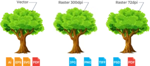
Vector Art images are created by mathematical formula. The art is constructed of points, lines, curves and shapes that are scalable to any size without losing clarity. Vector graphics are created in drawing programs such as Adobe Illustrator and CorelDraw. These images are very flexible to work with.
Raster Art (Bitmapped) images are pixel based and consist of rows of and columns of dots. Raster art is created by scanning a document or image. Photographs and graphics created in software programs such as MS Paint, Corel PhotoPaint and Adobe PhotoShop are raster images. Raster graphics can become distorted, ragged and blurry when reduced or enlarged. They are NOT very flexible to work with.
Resolution is the density of the dots in a raster image file, also known as DPI (dots per inch) or PPI (pixels per inch). Sharpness and clarity of a raster image is determined by and refered to as the resolution of the image. What looks sharp on a computer or mobile device screen may not always give you a sharp image when printed. To look good on a device screen an image only needs a resolution of 72 DPI. For large format printing, a minimum resolution of 300 DPI is required for an image to look sharp.
Translucent Color vs Opaque Color
Graphics for backlit applications will change color when they are illuminated. Please instruct us as to which lighting choice you wish to have the color matched.
Daytime non-illuminated (color will be lighter at night).
Nighttime backlit (color will be darker during daylight).
Color Guidelines
Can you print in RGB?
No. Files submitted to us in RGB will have to be converted to CMYK in order to print.
RGB is an additive process that uses Red, Green, and Blue light to achieve a color. It is considered additive because one must add all three colors together to achieve white. It is used for Monitors, TV’s, Phone Screens, etc. Unfortunately, it is not physically possible to print in RGB because mixing Red, Green, and Blue ink (pigment) would actually create a kind of brown color, not white as it does with the light in your computer monitor.
CMYK, on the other hand, is considered a subtractive process because, in order to get white, one must remove all color to allow the white to show through from the substrate material underneath it all.
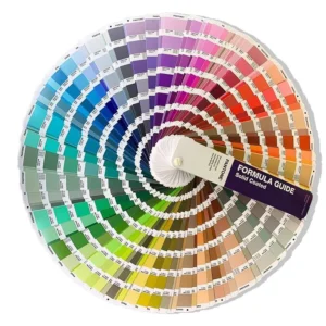
It’s also important to consider that RGB has many more color possibilities than CMYK. Never will colors on your monitor or screen match printed CMYK colors exactly. If color matching is critical, we suggest you use Pantone Solid Coated Colors in your file and order notes. With these colors, we can compare the printed graphics to our Pantone Book Standards here and get as close as possible. Here is a link to the Pantone Color Chart.
File Preparation
Submitted files should be professionally created at full size in Adobe Photoshop, Adobe Illustrator and saved as native files (.psd, .ai, .cdr or .pdf extensions, respectively). In many instances, PDF documents may be submitted, if prepared properly.
Please call for additional PDF workflow information. Files created in other applications may be acceptable, but may be subject to additional preparation charges.
Artwork which exceeds the pasteboard dimensions in Illustrator or FreeHand may be scaled down, but please indicate the scale (50%, 25%, 10%, 1″= 1′, etc.).
Any document containing text should have all text elements converted to outlines, or paths; doing so will avoid font conflicts—a major source of delay for many jobs. Remember to save a copy for yourself without converted text just in case last-minute edits are necessary. Avoid complex blends and paths, and any transparency effects in Illustrator or FreeHand; these effects can cause major delays, or even prevent a file from processing at all.
Spot or Pantone colors should be converted to process-color equivalents. Black should be built using 100% black, 60% cyan, 50% magenta and 50% yellow to provide optimum density.
Imported art elements should be linked, not embedded. Remember to update links and supply them along with the file to be output. When submitting Photoshop files, flatten the image and delete any extra alpha channels, if necessary. Furnish some form of color proof to match to, created from the submitted file and indicate any Pantone colors used.
Supply all full-color files in CMYK color space. Any artwork or imagery which extends to the edges of the finished piece will require bleed. Contact ES&A to determine how much bleed will be necessary for your project. Crop or trim marks should indicate the finished size of the piece.